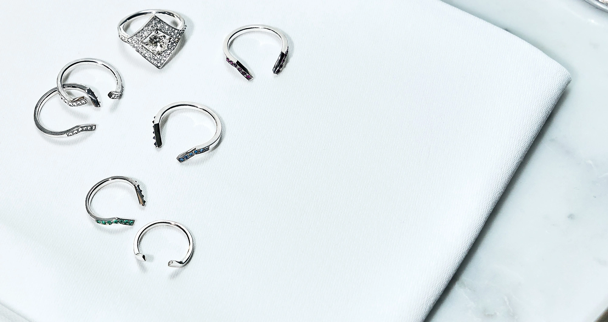
Brokn
Promote broken stones through an identity and a website designed for the luxury and fine jewelry sector
- Project name
- Brokn
- Customer
- BKN Jewelry
- Offer
- Tailor-made web development
Create a strong brand identity to be able to highlight the products of this fine jewelry startup
The idea
When Laure, the founder of Brokn, contacted us in January 2023, we were excited by her concept: creating high jewelry rings with broken stones!
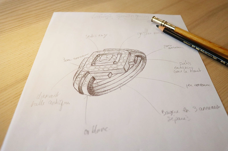
She had already been working on her project for a year and presented us with her sketches, her stones and her prototype.
His request was ambitious: to have a medium to present his know-how, and to address the market of individuals but also industrialists. All with a user experience that matches its rings, a minimalist interface, which is stunning.
The execution
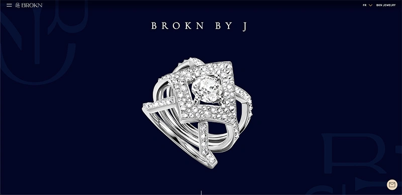
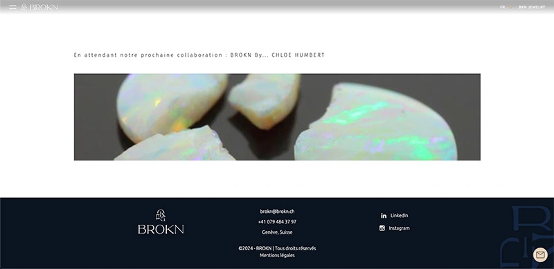
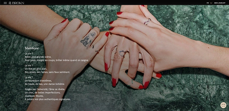
Today, this website represents the showcase of Brokn rings and the BKN Jewelery company, to highlight products with minimalism, aesthetics and modernity.
To create such a product, we divided it into 4 main phases:
To create such a product, we divided it into 4 main phases:
1/3 Functional scoping and UX/UI mockups
Functional scoping: based on its request, our teams worked to break the project into functionalities (called “user stories”) on a tool called Trello. At the end of this stage, Laure had in her possession a functional and technical description of her site.
Mid-Fidelity wireframes: thanks to work sessions, we created wireframes. In short, this is the stage where the design teams study user behavior (UX), its target and create “house plans”.
High-Fidelity mockups: once the wireframes are finalized, we tackle the “paint”. The Brokn team provided us with a graphic charter, which allowed us to save time. Using Figma, we created interactive prototypes of the platform to get an idea of the final visual rendering.
2/3 Web development and server implementation
Once the first step was completed, the Kinoba developers were able to get to work.
Thanks to an Agile and iterative methodology, we were able to deliver functionalities successively to the client to have their showcase site online as quickly as possible.
Thanks to an Agile and iterative methodology, we were able to deliver functionalities successively to the client to have their showcase site online as quickly as possible.
3/3 Maintenance
As soon as the site went live, we were able to make minor corrections and small improvements. This ensures that the Brokn website remains up to date over time.
The solution
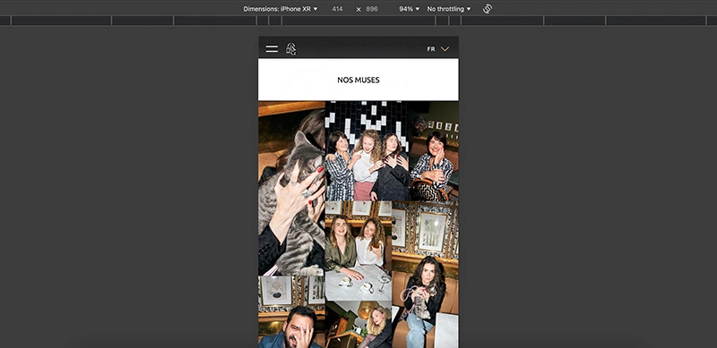
The imagined website was designed to work on mobile, tablet and desktop, and offer a unique experience to the visitor.
The site has several pages:
The site has several pages:
- The presentation of the Brokn philosophy
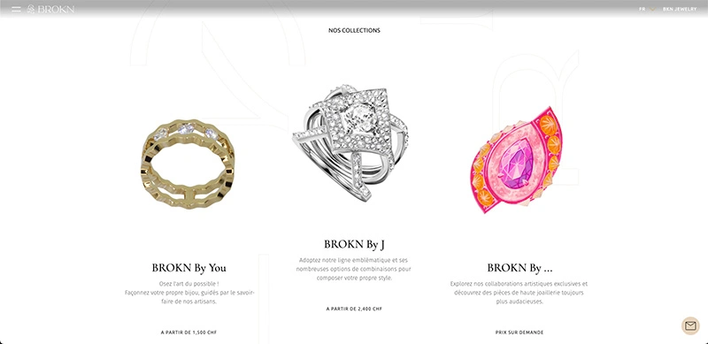
- Pages to present the various ranges, intended for B2C
- A page dedicated to industrial professionals
Thanks to its contact button available at any time on the site, users can contact the Brokn teams by email or telephone for all their requests.
The site is designed in several languages and is optimized from a referencing and SEO point of view. Particular attention was paid to the animations, to make the browsing experience pleasant.
The main constraint for this site was to offer a smooth browsing experience to users, while maintaining high quality images to present the rings. Thus, we worked precisely on the loading performance of all elements of the site (compression of images, sizes adapted to the device, lazy loading, etc.).
Our customers words
Laure Monge, Founder @Brokn
(Translated from French)
The Kinoba team is very professional. They were able to support the Brokn project with a beautiful website. www.brokn.ch
The Kinoba team is very professional. They were able to support the Brokn project with a beautiful website. www.brokn.ch
